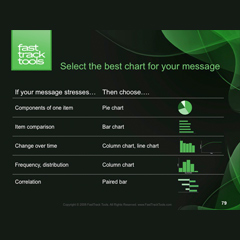
We have all perched around conference room tables with a perplexed look while thinking, “What’s up with that slide?” Like the slide shown here, it is a mixed bag of fonts, contains unrelated images, has unreadable text and is just plain confusing. You get caught up in the slide’s design and completely miss its message, even if it might illustrate the next great idea that could change your company for the better. I want you to turn your fantastic ideas into compeling presentations. In this post, I’ll provide you with some tips for slide design which will help hold your listeners’ attention.
The slides on your presentation will fall into two categories: text slides and exhibit slides. In the next handful of posts, I will walk you through tips for working with text slides, and then focus on working with exhibit slides.
Here are my tips for creating clear and impactful text slides…
- Deliver One Idea. Present and support one idea per slide. Remember the logic pyramid and use one slide for each statement in the pyramid.
- Use Talking Headers. Employ talking headers, not titles. Talking headers are key to writing compelling presentations. This concept is explored in detail in my next post.
- Keep It Brief. Your listeners want to hear your message directly from you, not read about it on your slides. Engage the audience without reading a lot of text.
- Use Simple Words and Numbers. Slides are meant to support what you are saying, not distract listeners with complicated text.
- Make It Readable. Make the type size readable. Readability varies for presentations depending on the location and audience. Make sure you think about your audience and choose a type size that won’t leave them squinting to see. Think about how readability varies for a small conference room presentation compared to one delivered in a meeting hall.
- Design Visually Interesting Slides. Tweak a text slide to appear more interesting! Check out the slide library for some new ideas. (Click here to download the slide library.)
- Use Grammatical Parallelism, especially for bullet points. A grammatically parallel structure is music to our ears and makes it easier for the human mind to understand your message. If one line begins with a verb, they all should. I am using grammatically parallel structure within the tip list you are currently reading!
- Add Animation Sparingly. Today’s mantra is “less is more” when it comes to animation! Use animation only to “build” your point. Animations can be distracting, such as when text is flying in and spinning before it lands. Create excitement in the room as a presenter, not by trying to artificially simulate it with excessive PowerPoint animations.
Keep in mind that your presentation should reflect a well thought-out PowerPoint deck and related script. Employing these tips will help you with the process. Next up — I’ll drill down into using talking headers in order do draw your listeners in.
